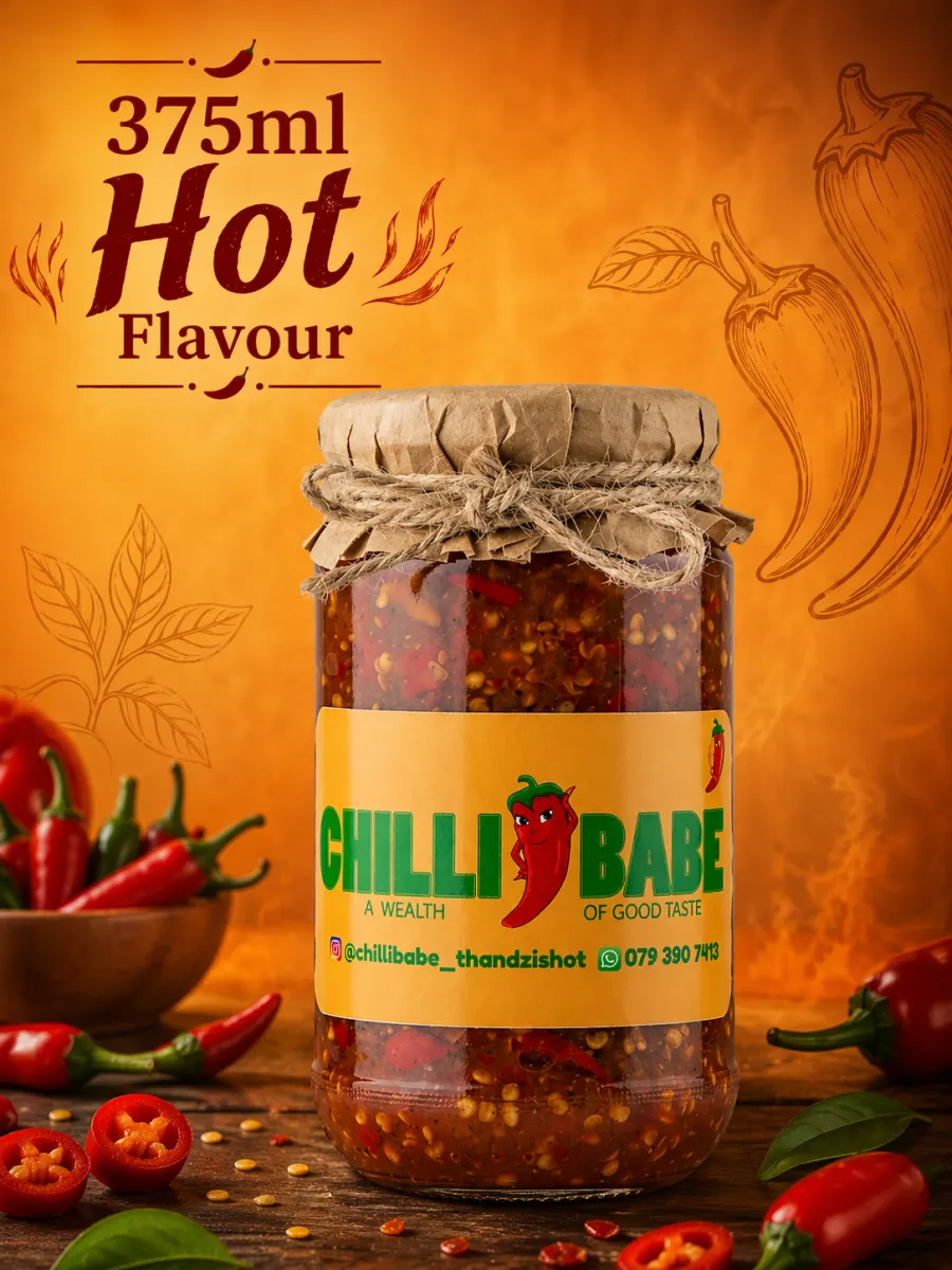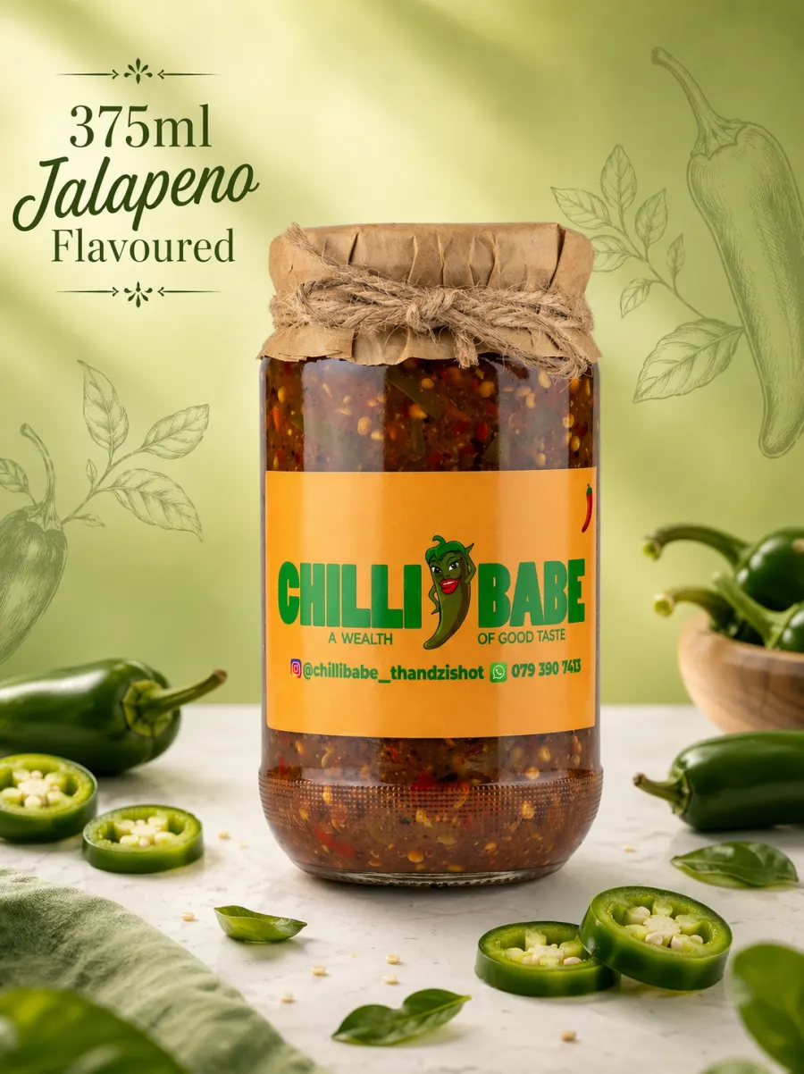
About The Range
About Us
A warmer, image-led brand story built around the jars, the label colours, and the handmade pantry feel.
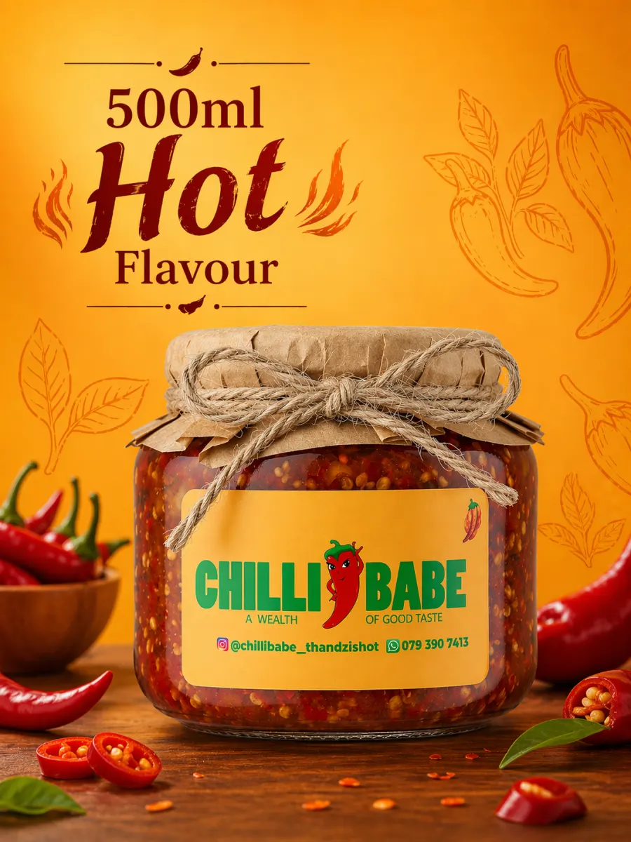
Use this page for the Chilli Babe story, process, and brand background.
Visual Direction
Amber labels, green logo, and handcrafted texture lead the redesign.
The updated theme takes its colour system from the real jars: warm amber from the labels, leaf green from the logo, kraft tan from the paper lids, and soft cream for breathing room. That keeps the layout feeling branded before the customer even starts reading.